Python
Statistical Analysis & Machine Learning Workflow for Property-pricing
The goal of this project is to work on a predictive model, that generates accurate predictions for future, yet-to-be-seen data. This includes pre-processing the data, selecting an approach for identifying optimal tuning parameters, building a model, and estimating predictive performance. This approach protects from overfitting the training data and helps the model to identify truly predictive patterns that are generalizable to future data, and enabling good predictions.


Getting to know your data
One of the first steps of the modeling process is to understand important feature characteristics such as their individual distributions, the degree of missingness within each feature, potentially unusual values, relationships between them, and the relationship between each feature and the target value, and so on. Undoubtedly, as the number of features increases, our ability to carefully curate each individual predictor rapidly declines. But automated tools and visualizations are available that implement good practices for working through the initial exploration process.
Data description
This project uses the Ames housing data available on Kaggle, which includes numerous features describing a wide range of characteristics of 2,930 homes in Ames, Iowa sold between 2006 and 2010. Most of the variables are exactly the type of information that a typical home buyer would want to know about a potential property (e.g. When was it built? How big is the lot? How many square feet of living space is in the dwelling?, etc.)
From the original dataset, in this detailed guide, I already pre-selected the features I would like to further investigate, therefore here is a brief version of what columns our data contains, along with a short description:
Id: Unique id number for the property.
MSZoning: Identifies the general zoning classification of the sale.
LotArea: Lot size in square feet.
GrLivArea: Above grade (ground) living area square feet.
GarageArea: Size of garage in square feet.
TotalBsmtSF: Total square feet of basement area.
PoolArea: Pool area in square feet.
YearBuilt: Original construction date.
GarageYrBlt: Year garage was built.
LandContour: Flatness of the property.
Utilities: Type of utilities available.
Heating: Type of heating.
Electrical: Electrical system.
OverallQual: Rates the overall material and finish of the house
SaleType: Type of sale.
SalePrice: Sale price. (Which we would like to predict)
Importing necessary libraries and datasets
As the computational engine for this project, I have used Python. While it's not the only good option, Python has been shown to be one of the most popular and effective programming language for data scientists, it's also free and open-source, so you can install it anywhere, modify the code, and have the ability to see exactly how computations are performed.
NumPy and Pandas simplify analyzing and manipulating data
Matplotlib provides attractive data visualizations
Scikit-learn offers simple and effective predictive data analysis
XGboost supply machine learning and deep learning capabilities
'''Importing libraries'''
import pandas as pd # Data processing
import numpy as np # Linear algebra
import matplotlib # Basic visualization
import matplotlib.pyplot as plt
import seaborn as sns # Advanced visualization
import xgboost as xgb # Regression model
from sklearn.model_selection import train_test_split
from sklearn.metrics import mean_squared_error, r2_score, make_scorer
from sklearn.model_selection import GridSearchCV
Let's begin our Exploratory data analysis (EDA) with examine the characteristics of each feature.
Numerical features
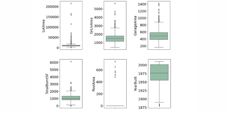
Variable that can be measured and that can assume different values. For numerical features, we are always concerned about the distribution of the numerical values, including statistical characteristics such as mean, median, and mode. In order to visualize it, we usually use "Histograms" and "Boxplots". Both visualizations are useful to look for any outliers we might need to filter out later on during a preprocessing procedure.
'''Numeric Features visualization'''
numeric_train = train.select_dtypes(exclude=['object']).copy()
fig = plt.figure(figsize=(10,60))
for index,col in enumerate(numeric_train):
    plt.subplot(16,1,index+1)
    sns.histplot(numeric_train.loc[:,col].dropna(), kde=False)
    plt.grid(linewidth = 0.3)
fig.tight_layout(pad=1.0)

'''Table view'''
train.describe().T
Histograms
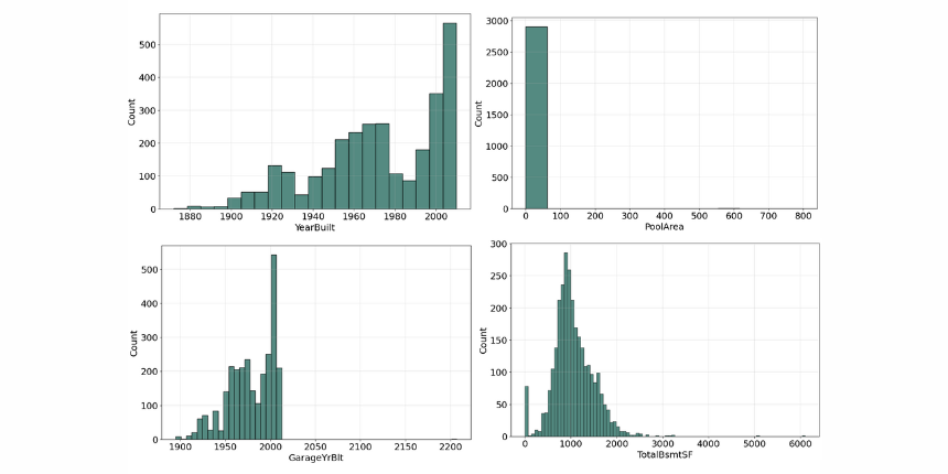
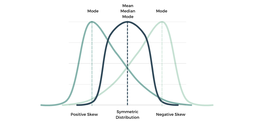
An early step in any effort to analyze or model data should be to understand how the variables are distributed. Perhaps the most common approach to visualize a distribution is the histogram, it lets us discover, and show, the underlying frequency distribution (shape) of a set of continuous data.

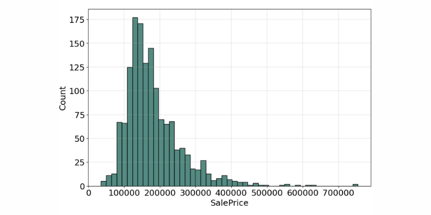

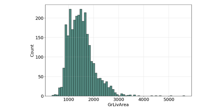

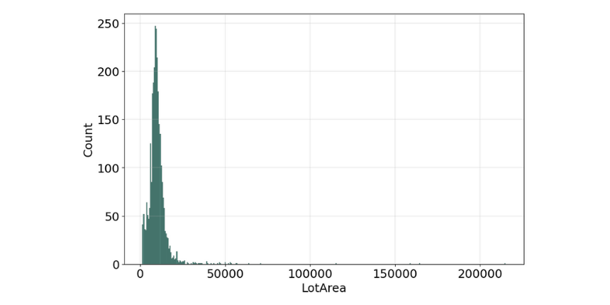
The histogram for many of the features is not symmetric shape, the most frequently occurring values tend to be on the left ends of the scale, except for the property building year, where it's on the right side, which means the data we have, do not show the characteristic "bell curve" of what statisticians call a normal distribution (mean and mode at the center with symmetric tails), however, we are able to work on that later with some feature engineering techniques.

We can think of the histogram as a "front elevation" view of the distribution, and the box plot as a "plan" view of the distribution from above.
Boxplots
That is why box plots are also relatively useful graphical tools for looking at the distribution of data. The main part of the chart (the “box”) shows where the middle portion of the data is. At the bottom of the box, you find the first quartile and the third quartile marks. The far bottom of the chart is called the whisker which is the minimum and the far top is the maximum value, unless we use alternative whiskers, then the whisker markings at other percentiles of data and there is an additional dots marking located outside the whiskers which define the outlier values. Finally, the median is represented by a vertical bar in the center of the box.
When reviewing a box plot we should look for the followings:
Is the box plot symmetrical overall?
Are the first quartile and third quartile approximately the same distance from the median?
Are the "whiskers" of the plot approximately the same length?
Are there any outlier data points?

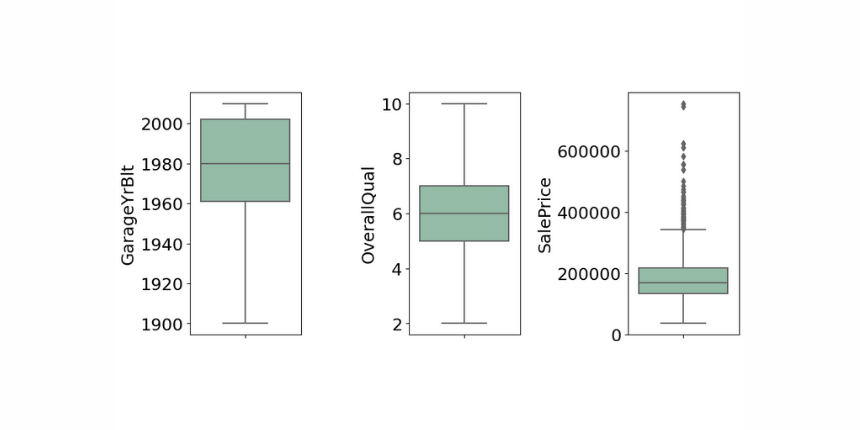
Overall quality is very symmetrical, the whiskers are almost the same distance from each other, and there is no outlier data, therefore it follows a normal distribution, on the other hand, the sale price box plot is smaller, the data is less dispersed, the observed elements includes a lot of outlier data.

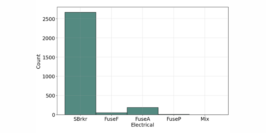
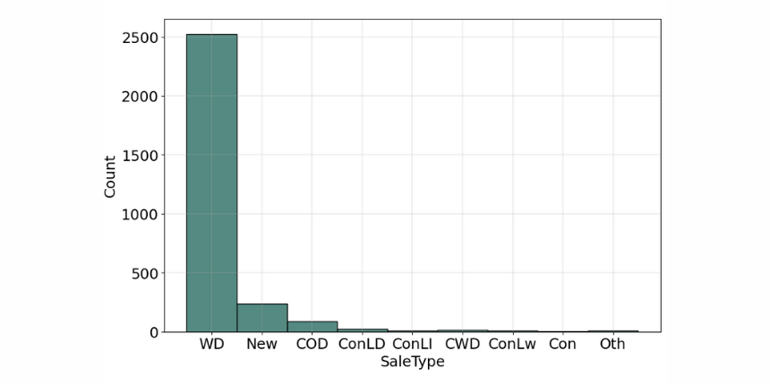
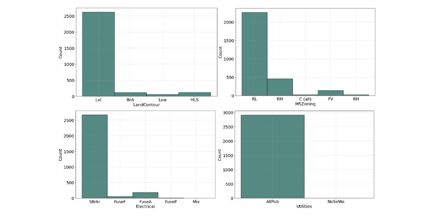
Categorical features
Variable that has two or more categories, but there is no intrinsic ordering to the categories. Understanding the distribution of categorical variables, we often use "Countplots" to visualize the count of each distinct value within each feature.
'''Categorical Features visualization'''
cat_train = train.select_dtypes(include=['object']).copy()
fig = plt.figure(figsize=(10,60))
for index,col in enumerate(cat_train):
    plt.subplot(16,1,index+1)
    sns.histplot(cat_train.loc[:,col].dropna(), kde=False, color=color)
    plt.grid(linewidth = 0.3)
fig.tight_layout(pad=1.0)

'''Table view'''
train.describe(include='O').T
Countplots


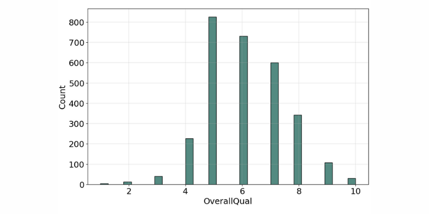
Ordinal Variable
Similar to categorical but there is a clear ordering of the categories. The 'OverallQual' is a perfect example of this variable type, as it's rating the property quality on a scale of 1 to 10, where 10 means it's very excellent and 1 means it's very poor.

Bivariate analysis
As we need to know more about the relationships between these features, further deepen our insights and uncover potential patterns in the data, our best bet is to make a Bivariate Analysis. Bivariate Analysis examines at two different features to identify any possible relationship or distinctive patterns between them. One of the most commonly used technique for this analysis is the "Correlation Matrix" which is an effective tool to uncover linear relationships between any continuous features. In our case correlation not only allow us to determine which features are important to Saleprice, but also as a mean to investigate any multicollinearity between our independent predictors.
'''Correlation matrix'''
corrmat = data.corr()
sns.heatmap(corrmat,
            cmap=cmap,
            annot=True,
            linewidths=.5,
            annot_kws={"fontsize":15},
            fmt='.2f')
'''Table view'''
corrmat[['SalePrice']].sort_values(['SalePrice'], ascending=False)
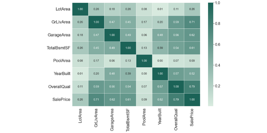
As we can see 'OverallQual' and 'GrLivArea' are highly correlated to the 'SalePrice', which can confirm our assumption that there is a linear relationship between these features and the target.
Also 'YearBuil' and 'GarageYrBlt' are moderately correlated to the target, however, as we can see there is a strong connection between these two, which means they have multicollinearity, and when it occurs we can drop one of them out or combine the two features to form a new one, which can further be used for prediction. This finding will guide us in our preprocessing steps later on as we aim to remove highly correlated features to avoid performance loss in our model.
Data processing
After we finished analyzing our data and gaining insights through the various analysis and visualization, we will have to leverage these insights to guide our preprocessing decision, so as to provide clean and error-free data for our model to train on later.
Encoding features
Based on the dataset description and with some additional background knowledge, we know what the following feature values stand for, and we can manually assign an ordered relationship between each other.
MSZoning_dic = {
    'A': 0, #'Agriculture'
    'C': 1, #'Commercial',
    'FV': 2, #'Floating Village Residential',
    'I': 3, #'Industrial',
    'RH': 4, #'Residential High Density',
    'RL': 5, #'Residential Low Density',
    'RP': 6, #'Residential Low Density Park',
    'RM': 7} #'Residential Medium Density'
Utilities_dic = {
    'AllPub': 0, #'All public Utilities (E,G,W,& S)'
    'NoSewr': 1, #'Electricity, Gas, and Water (Septic Tank)'
    'NoSeWa': 2, #'Electricity and Gas Only'
    'ELO': 3} #'Electricity only'
Electrical_dic = {
    'SBrkr': 0, #'Standard Circuit Breakers & Romex'
    'FuseA': 1, #'Fuse Box over 60 AMP and all Romex wiring (Average)'
    'FuseF': 2, #'60 AMP Fuse Box and mostly Romex wiring (Fair)'
    'FuseP': 3, #'60 AMP Fuse Box and mostly knob & tube wiring (poor)'
    'Mix': 4} #'Mixed'
We defined the feature values in dictionaries and replaced them with a map function.
'''Ordinal encoding'''
data.MSZoning = data.MSZoning.map(MSZoning_dic)
data.Utilities = data.Utilities.map(Utilities_dic)
data.Electrical = data.Electrical.map(Electrical_dic)
For categorical variables where no ordinal relationship exists, the integer encoding may not be enough, at best, or misleading to the model at worst.
Forcing an ordinal relationship via an ordinal encoding and allowing the model to assume a natural ordering between categories may result in poor performance or unexpected results (predictions halfway between categories).
In this case, a one-hot encoding can be applied to the ordinal representation. This is where the integer encoded variable is removed and one new binary variable is added for each unique integer value in the variable.
'''One-hot encoding'''
data = pd.get_dummies(data)
One-hot-encoding is the most general approach, and it works very well unless your categorical variable takes on a large number of values (i.e. you generally won't use it for variables taking more than 15 different values).
Features with missing values
We have to check if there is any missing value in our data.
'''Missing values'''
df = pd.DataFrame({'Type': data.dtypes,
                  'Missing': data.isna().sum(),
                  'Size': data.shape[0],
                  'Unique': data.nunique()})
df['Missing_%'] = (df.Missing/df.Size)*100
df[df['Missing']>0].sort_values(by=['Missing_%'], ascending=False)
Result:
Electrical | Type: object| 5 missing values
TotalBsmtSF | Type: float64 | 1 missing value
Two features have missing data, which is not allowed in our model, hence the missing observation is replaced by the most frequent category for the object type and with the median in the numerical type variable.
'''Fill missing values'''
data['Electrical'] = data['Electrical'].fillna(data['Electrical'].mode()[0])
data['GarageArea'] = data['GarageArea'].fillna(data['GarageArea'].median())
Dealing with multicollinearity and outliers
As we stated before, to avoid performance loss we have to deal with the multicollinearity features. In this scenario, we will drop out the 'GarageYrBlt' and keep the property building year.
'''Dealing with multicollinearity '''
data= data.drop(['GarageYrBlt'])
Outliers can occur for many reasons, maybe the recorded data had errors or some luxury properties have extreme values, either way, it's a statistical anomaly that doesn't represent a typical house. Previously on the distribution graphs, we could see some very high values in some of our numerical features, and since no observations have been removed yet due to unusual values, I would recommend removing any houses with more than 4,000 square feet 'TotalBsmtSF' and 'GrLivArea' from the data set, along with more than 100,000 square feet 'LorArea', as these extraordinary values can cause additional accuracy loss.
'''Dealing with outliers'''
data= data.drop(data[data['TotalBsmtSF'] > 4000].index)
data = data.drop(data[data['GrLivArea'] > 4000].index)
data= data.drop(data[data['LotArea'] > 100000].index)
At this point, our data is properly cleaned and pre-processed for the modeling phase, however, we can still make some adjustments regarding the target SalePrice.
Feature engineering
In many analyses, the response variable should be normally distributed to get better prediction results.
print("Skewness: %f" % train['SalePrice'].skew())
print("Kurtosis: %f" % train['SalePrice'].kurt())
Original results:
Skewness: 1.882876
Kurtosis: 6.536282

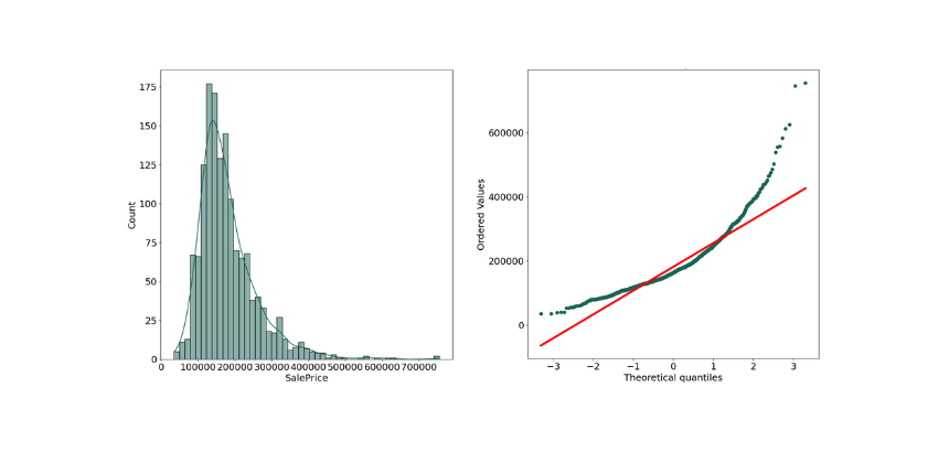
As we can see the above plot is not normal distribution as there is some positive skewed data.
Measuring normal distribution
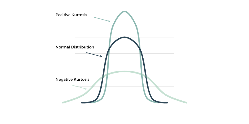
"Skewness" is a measure of the asymmetry of a distribution. A distribution is asymmetrical when its left and right side are not mirror images. A distribution can have right (or positive), left (or negative), or zero skewness.

"Kurtosis" is a statistical measure that defines how heavily the tails of distribution differ from the tails of a normal distribution.

When our original continuous data do not follow the bell curve, we can log transform this data to make it as “normal” as possible so that the statistical analysis results from this data become more valid. In other words, the log transformation reduces or removes the skewness of our original data. The important caveat here is that the original data has to follow or approximately follow a log-normal distribution. Otherwise, the log transformation won’t work.
'''Normalize our data with log transformation'''
train["SalePrice"] = np.log1p(train["SalePrice"])
data["SalePrice"] = np.log1p(data["SalePrice"])
After log transformation results:
Skewness: 0.121347
Kurtosis: 0.809519

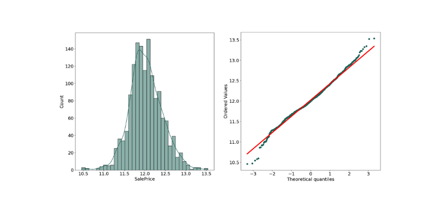
As we can see the Skewness got reduced in transformed data, and the SalePrice shows the characteristic "bell curve" which means it follows now a normal distribution, this transformation will help the model accuracy.
Modeling
Having identified the numeric and categorical features for inclusion in the model, imputing all missing values for these features, encoding them, and dealing with the outliners, we are then ready to create a model to predict the sales price, with a regression model.
Regression is a statistical technique of fundamental importance to science because of its ease of interpretation, robustness, and speed in calculation, in machine learning, the goal of regression is to predict a numeric, quantifiable value, such as a price or other scalar number.
In real-world situations, particularly when little data are available, regression models are very useful for making predictions.
To train the model, we start with a data sample containing the features, as well as known values for the label - so in this case, within "train_x" we have data that includes features about the properties, and within "train_y" we have the actual sale prices as the label.
The data was subset into the train and test splits.
A training dataset to which we'll apply an algorithm that determines a function encapsulating the relationship between the feature values and the known label values.
A validation or test dataset that we can use to evaluate the model by using it to generate predictions for the label and compare them to the actual known label values.
'''Split data to train and test'''
# Separate features and labels
features = data.drop(columns=['SalePrice'])
labels = data['SalePrice']
# Split data 70%-30% into training set and test set
x_train, x_test, y_train, y_test = train_test_split(
                                features, labels,
                                test_size=0.30,
                                random_state=0)
print ('Training Set: %d rows\nTest Set: %d rows'
%(x_train.shape[0], x_test.shape[0]))One of the most common ways to measure the loss is to square the individual residuals, sum the squares, and calculate the mean. Squaring the residuals has the effect of basing the calculation on absolute values (ignoring whether the difference is negative or positive) and giving more weight to larger differences. This metric is called the Mean Squared
'''Building the model'''
model = xgb.XGBRegressor()
model = model.fit(x_train, y_train)
print(model)
predictions = model.predict(x_test)
print(model.score(x_train, y_train))
There's a definite diagonal trend, and the intersections of the predicted and actual values are generally following the path of the trend line, but there's a fair amount of difference between the ideal function represented by the line and the results. This variance represents the residuals of the model - in other words, the difference between the label predicted when the model applies the coefficients it learned during training to the validation data, and the actual value of the validation label. These residuals when evaluated from the validation data indicate the expected level of error when the model is used with new data for which the label is unknown.
Regarding a regression model, you can quantify the residuals by calculating a number of commonly used evaluation metrics:
Mean Square Error (MSE): The mean of the squared differences between predicted and actual values. This yields a relative metric in which the smaller the value, the better the fit of the model
Root Mean Square Error (RMSE): The square root of the MSE. This yields an absolute metric in the same unit as the label (in this case, the sale price of the property). The smaller the value, the better the model (in a simplistic sense, it represents the average number of the sale prices by which the predictions are wrong!)
Coefficient of Determination (usually known as R-squared or R2): A relative metric in which the higher the value, the better the fit of the model. In essence, this metric represents how much of the variance between predicted and actual label values the model is able to explain.
'''Result before optimising'''
mse = mean_squared_error(y_test, predictions)
print("MSE:", mse)
rmse = np.sqrt(mse)
print("RMSE:", rmse)
r2 = r2_score(y_test, predictions)
print("R2:", r2)
First results
MSE: 0.0130
RMSE: 0.114
R2: 0.855
We've quantified the ability of our model to predict the sale price. There is no doubt it has some predictive potential, although we are still able to make it even better, by tuning the algorithm performance.
Improve models with hyperparameters
Hyperparameters are values that change the way that the model is fit. The hyperparameters of a regression model differ from the model parameters, the parameters are defined during model training, and the hyperparameters need to be set before the model is trained. By hyperparameter optimization, we mean the process of training the same model with several different hyperparameter settings (Most machine learning algorithms have such initial parameters that affect the final models. In the case of decision trees, an example is the maximum depth of the tree), and then the performance of the trained models is compared and the most appropriate optimization values for the given task are selected.
nrounds: number of decision trees used.
eta: The learning rate, which can take a value between 0 and 1. If the value is too low, convergence to the optimal solution is slow (the algorithm reaches the optimum only slowly or not at all - it exits sooner), while if the value is too high, divergence may occur (the algorithm moves further and further away from the optimum).
gamma: The minimum reduction in the loss function required to split a given leaf peak.
max_depth: Maximum depth of the decision tree. Too small a value may lead to an oversimplified model, while too large a value may lead to overfitting.
min_child_weight: Minimum amount of weight in the leaf tips of the decision trees. Too high a value may lead to an oversimplified model, while too low a value may lead to over-learning.
subsample: the proportion of observations used to construct a given decision tree. It may be useful if not all observations are used for each decision tree, because this is expected to make the constructed decision trees more diverse, thus increasing model performance without over-learning.
colsample_bytree: The proportion of explanatory variables used to construct a given decision tree. It may be useful if not all explanatory variables are used for each decision tree, because this is expected to make the constructed decision trees more diverse, thus increasing model performance without over-learning.
# Use a XGB Boosting algorithm
alg = xgb.XGBRegressor()

# Try these hyperparameter values
params = {'nrounds' : [100,500,1000],
            'eta' : [0.2,0.1,0.01],
            'max_depth' : [2, 3],
            'gamma' : [0,1],
            'colsample_bytree':[1],
            'min_child_weight':[1, 2],
            'subsample':[1]}

# Find the best hyperparameter combination to optimize the R2 metric
score = make_scorer(r2_score)
gridsearch = GridSearchCV(alg, params, scoring=score, cv=3, return_train_score=True)
gridsearch.fit(x_train, y_train)
print("Best parameter combination:", gridsearch.best_params_, "\n")
Best parameter combination: {'colsample_bytree': 0.5, 'eta': 0.2, 'gamma': 0, 'max_depth': 3, 'min_child_weight': 4, 'nrounds': 1000, 'subsample': 1}
Results after boosting
MSE: 0.0117
RMSE: 0.108
R2: 0.870
After the hyperparameters are set with cross-validation, our final model performed even better.
'''Save the model as a pickle file'''
import joblib
filename = './house-predict.pkl'
joblib.dump(model, filename)
Now, we can load it whenever we need it, and use it to predict the sale price for new data. This is what we call scoring or inferencing.

