Power BI
Power BI Custom Visuals: Comprehensive Guide
Explore the world of custom visuals in Power BI. This comprehensive guide demystifies how custom visuals can fulfill unique business needs, enhance data visualization, and ultimately serve as a game-changer in your data analysis toolkit. By the end of this article, you'll understand what custom visuals are capable of and how to create your own, with a step-by-step example to guide you.

Introduction
I've always been intrigued by the idea of developing a Power BI custom visual. However, it took a while for me to roll up my sleeves and dive in, due to time constraints and different learning curves, especially in areas like TypeScript and D3, which are the foundation of creating custom visuals. Surprisingly, when I finally embarked on the journey, it was a pleasant revelation that it wasn't as formidable as it initially seemed, despite the limited resources available for guidance on the Power BI visual development side.
Microsoft's official documentation on custom visuals has improved significantly over time, yet it still lacks depth. It provides a helpful guide for configuring the required development environment and offers various tutorials. However, you can find most of the information in GitHub repositories. These repositories provide sample visual source codes, which can give you valuable patterns if you're ready to dive into the depths of the code.
Given the broad scope of this topic, I've broken it down into bite-sized sections. Start by introducing a typical use-case scenario, then setting up the development and testing environment provided by Microsoft. Subsequently, focus on creating the visual using D3.js. Once that's accomplished, bind the actual data to the visual and introduce formatting options and interactive features. To conclude, package the visual and prepare it for deployment.
The full source code of this project is available on GitHub, see gradientcirclechart-power-bi-custom-visual.
Example Use Case
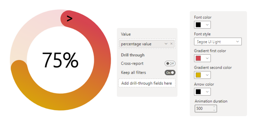
Let's illustrate this with an example use case. Imagine a business scenario requiring a uniquely designed KPI (Key Performance Indicator). This KPI is intended to visually show a value in terms of percentage compared to the target, which is 100%. Although Power BI's built-in visuals have the ability to functionally fulfill this requirement, it might need to improve when it comes to providing a visually appealing user interface that aligns with modern design.
In such a scenario, creating a custom visual can be a good solution since it enables the integration of compelling features like animations, improving the user experience and making data interpretation more engaging and intuitive.
Setting up the environment
Power BI Visuals SDK (Software Development Kit) is a powerful tool provided by Microsoft that simplifies the process of creating custom visuals. The toolkit generates a predefined folder structure for a consistent and organized development environment. At the time of writing this article, the latest version of the Power BI visuals API is v5.4.0.
Prerequisites
Ensure you have all the necessary components outlined in this section before you start the development of your Power BI visual.
Windows PowerShell version 4 or later (for Windows) for installing node.js and pbiviz.
A Power BI Pro or Premium Per User (PPU) account, and enabled the visuals developer settings.
For more detailed instructions regarding the setting up, visit the following Microsoft documentation.
Project structure
Select the local folder of the project and use the following command in the PowerShell terminal:
pbiviz new gradientcirclechart-power-bi-custom-visualHere's a brief description of the folder structure:
.vscode: This directory contains the VS Code project settings. (not in scope)
.assets: This directory contains any static resources used by the visual, like the icon of the visual.
.dist: This is where the packaged visual (.pbiviz) is located after it's built, to distribute the visual.
node_modules: This directory is created when you run npm install and contains all the dependencies needed for the project.
style: This directory holds the visual.less file, which is a LESS stylesheet that gets compiled into CSS and defines the visual's appearance.
src: This is where all the source code for the visual resides. It includes a visual.ts and setting.ts file, which is the main TypeScript file where the visual's logic is written.
Additionally, in the root folder, you can find the following files:
capabilities.json: Defines the capabilities of a Power BI visual, such as data roles and view mappings.
package-lock.json: Auto-generated by npm to lock versions of a package's dependencies, ensuring consistency across environments.
package.json: Contains metadata about the project and its dependencies.
pbiviz.json: Configuration file for a Power BI visual, including metadata and information on external assets.
tsconfig.json: Specifies root files and compiler options for TypeScript compilation.
tslint.json: Configuration file for TSLint to enforce code quality and consistency rules in TypeScript.
At first, it may look a bit overwhelming, however, it all comes down to making the development process more fluent and consistent across other visuals.
Debugging view
The debugging view is an essential part of the creating process since it's not just previewing our code's results, but getting crucial information about the underlying metadata and DOM elements. While developing, it's a necessary process to test it on the run. Luckily Power BI service supports a native development mode after you enable it on the development settings.
Prepare a sample dataset and publish it in your workspace to make the debugging available. It should contain a single table with a single percentage number. In this case, the column name: "percentage_value" with a number of 0.75.
Creating the visual
The visual.ts file is where you define the behavior of the custom visual and how it interacts with data. The main content of this file is the Visual class. This class implements the IVisual interface and has two main methods inside:
Constructor method: The constructor sets up the initial state of the main DOM elements by appending the necessary SVGs, groups, and their class names.
constructor(options: VisualConstructorOptions) {
    this.target = options.element;
    // ... other initialization code
}
Update method: The update is called whenever the visual needs to be updated, for example, changes in the data, changes in the visual's size, or formatting.
public update(options: VisualUpdateOptions) {
    // ... other update code, such as redrawing the visual
}
Import d3 library
As you begin working on the visual, you can see the first few lines are dedicated to import statements. These are for loading the external modules that your custom visual depends on. In order to import the d3 add the following line of code:
import { select, arc, interpolate, interpolateBasis } from "d3"; // Import d3 moduls
type Selection<T extends d3.BaseType> = d3.Selection<T, any, any, any>;For this project, use the following d3 modules:
'select': is a fundamental method used to select a DOM element for data binding, styling, or appending.'arc': provides functionality for generating arc shapes.'interpolate': offers functions to transition smoothly between initial and final states.'interpolateBasis': creates a basis spline interpolator for smooth transitions over an array of values.
The second line of code is a TypeScript type definition, where the type of element is defined, but the types of datum and parent elements and data are not specified.
Construct SVG layers
Under the Visual class, add a private class field for all the SVG elements used by the circle chart.
import { VisualFormattingSettingsModel } from "./settings";

export class Visual implements IVisual {
    private target: HTMLElement;
    private formattingSettings: VisualFormattingSettingsModel;
    private formattingSettingsService: FormattingSettingsService;
    private svg: Selection<SVGElement>;
    private parentGroup: Selection<SVGElement>;
    private backgroundArc: Selection<SVGElement>;
    private progressArc: Selection<SVGElement>;
    private pctLabel: Selection<SVGElement>;
    private arrowLabel: Selection<SVGElement>;
    private gradient: Selection<SVGElement>;
static margin = { top: 5, right: 5, bottom: 5, left: 5 };'target': This represents the HTML element in the DOM where the visual will be rendered.'formattingSettings'and'formattingSettingsService': are default instances for related formatting options.
Under the SVG tag, each element corresponds to a specific part of the visual. Imagine it like you putting different shapes and forms of layers on paper, and together, they make a whole picture. Let's illustrate with the following:
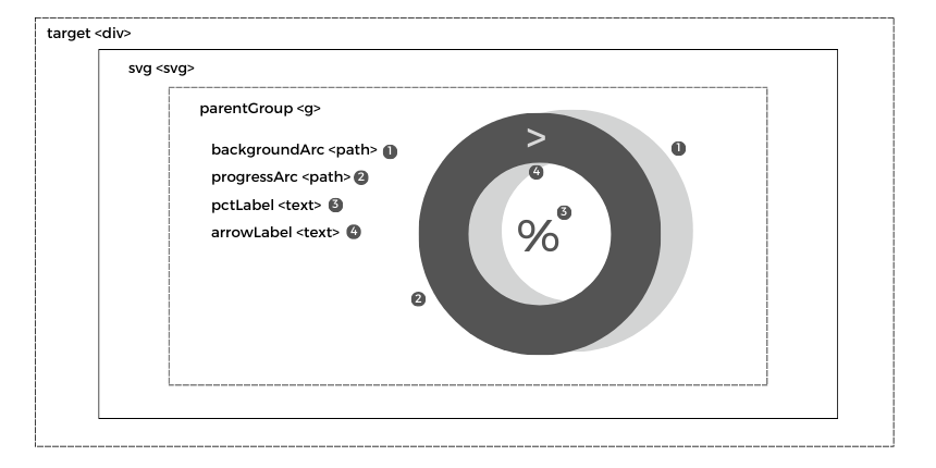
The constructor builds up our initial elements and the layer order. This means the first line of code will be in the back, and the last is in the front, overlapping each other. Use the following code inside the constructor:
constructor(options: VisualConstructorOptions) {
    console.log('Visual constructor', options);
    this.formattingSettingsService = new FormattingSettingsService();
    this.target = options.element;

    if (document) {
        // Create the DOM element classes and ids
        this.svg = select(this.target).append('svg').classed('mainGroup', true);
        this.parentGroup = this.svg.append('g').classed('parentGroup', true);
        this.backgroundArc = this.parentGroup.append('path').classed('backgroundArc', true);
        this.progressArc = this.parentGroup.append('path').classed('progressArc', true);
        this.pctLabel = this.parentGroup.append('text').classed('pctLabel', true);
        this.arrowLabel = this.parentGroup.append('text').classed('arrow', true);
        this.gradient = this.svg.append("defs").append("linearGradient").attr("id", "gradient")
        this.gradient.append("stop").attr("id", "gradientFirst")
        this.gradient.append("stop").attr("id", "gradientSecond")
    }
}The 'parentGroup' is a group element. It groups together related graphics elements, allowing transformations or styling to be applied to them collectively, and not lastly, it makes the project better structured. The 'backgroundArc' is a whole arc. In another world, it's a full circle with a hole inside. Since there is no default shape like this, it uses a path element and draws it with the d3 arc function. This is used as the background in the visual. The 'progressArc' is the same, but it's on top of it, and the fullness depends on the data, as well as the 'pctLabel', which is in the middle showing the percentage value. The 'arrowLabel' is a UI design element, the same as the 'gradient' that colors the arcs.
At this point, if you start the debugging view, the visual is empty. However, if you inspect the DOM elements, you should see them, at this time, without any additional attributes inside since they are not yet populated.
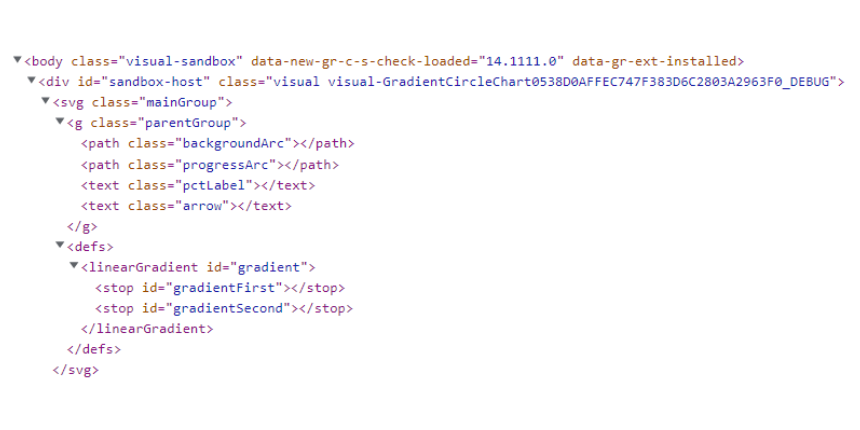
After successfully creating the visual structure, the following part is to draw the visualization inside the update function.
Draw the visual
Inside the update method, let’s define all the needed variables.
// Define variables
const pct = 0.49 // Static value until data binding
const { width, height } = options.viewport;
const margin = Visual.margin;
const chartHeight = height - margin.top - margin.bottom;
const chartWidth = width - margin.left - margin.right;
const fullCircle = Math.PI * 2;
const r = Math.min(chartWidth, chartHeight) / 2;
const duration = 1000;
Until there is no connection between the actual data and the visual yet, set 'pct' (percentage) as a constant with a value of 0.49. The 'options.viewport' stores the size of the visual view area. Whenever a user changes the visual window size, these attributes are updated. Based on this and the margins, set up the chart size to be sure not to draw outside the viewport. The 'fullCircle' represents the radian measure of a full circle. In geometry, a full circle is equivalent to 2π radians. The 'r' sets the radius, and applying the chart sizes in the calculation allows a responsive feature based on the size of the active viewport.
Now that the variables are set, let's attach the view sizes and group elements to the SVG.
// Attach the drawing area responsive size
this.svg.attr('width', width).attr('height', height)
this.parentGroup.attr('transform', `translate(${margin.left},${margin.top})`);
The transform attribute is to manipulate the position and shape of elements. It takes two parameters, x (horizontal direction) and y (vertical direction).
Create the background and the progress arc with the d3 arc function and store them.
// Create the Arcs
const bgArc = arc()
  .innerRadius(r / 1.5)
  .outerRadius(r)
  .startAngle(0)
  .endAngle(fullCircle)
const progArc = arc()
  .innerRadius(r / 1.5)
  .outerRadius(r)
  .startAngle(0)
  .endAngle(0)
  .cornerRadius(60)
The essential attributes for defining an arc using d3.arc() are the following:
'innerRadius': This determines the inner radius of the arc, for example, creating a donut chart. If the inner radius is set to 0, it generates a pie chart instead.'outerRadius': This determines the radius of the arc.'startAngle': This determines the start angle of the arc in radians. Both start from 1, which is the top of the chart.'endAngle': This determines the end angle of the arc in radians. The background is a full circle. However, for the progression, it starts from 0 and manipulated by the data, it can be maximum a full circle.
Draw the background arc, and set the size based on the radius.
// Attach the static background arc
this.backgroundArc.attr('d', bgArc)
  .attr('transform', `translate(${r}, ${r})`);
The 'd' attribute holds a series of commands and parameters defining the shape of the path. When changing the '.attr('d', bgArc)', it defines the path element's value, which is generated by the arc function. Additionally, transform the x and y value by the amount of the radius. This is needed because otherwise, the circle's middle point would be at the top-left corner.
Attach the progress arc label and add animation.
// Attach the progress arc label and the animation
this.progressArc
    .attr('d', progArc)
    .attr('transform', `translate(${r}, ${r})`)
    .transition()
    .duration(duration)
    .attrTween('d', () => {
        const minimumInterpValue = 0.4;
        const interp = interpolate(minimumInterpValue, Math.max(fullCircle * pct, minimumInterpValue));
        const interpBasis = interpolateBasis(Array(40).fill(60).concat([0]));
        return (t: number) => {
            progArc.endAngle(interp(t));
            if (pct >= 1) {
                progArc.cornerRadius(interpBasis(t));
            }
            return progArc(null);
        };
    });
Let's break down this code snippet into smaller sections for a better understanding. First, it sets the same size attributes as the background arc after it uses the 'transition()' and '.duration()' functions, which initiates a transition and sets its time length in milliseconds. The '.attrTween()' compute intermediary values of 'd' over the duration of the transition as the attribute changes from one value to another, giving the appearance of a smooth animation. That is why it's needed to make a function inside it that changes the attribute of 'endAngle' and 'cornerRadius' of the arc when the time '(t)' changes.
See the following example of how the 'interpolate' function changes between two values:
let interp = interpolate(0, 60);
console.log(interp(0));   // outputs: 0
console.log(interp(0.5)); // outputs: 30
console.log(interp(1));   // outputs: 60
The 'interpolateBasis' does the same, but in that case, you have to define your own array of values, not just the two endpoints. This is used when the percentage value is 100%, and the arc needs to form a full circle. However, if the corners are still rounded and not set to the null value, then it would never fill entirely.
There is also a minimum value ('minimumInterpValue') set for the visual when interpolating. This means that the progress is not starting from 0 but instead from 0.4 because otherwise, it would mess up visually the arrow UI element.
Attach the percentage text label and the top arrow.
// Attach the percentage text label, and the animation for it
const pctLabel = this.pctLabel
    .attr('x', r)
    .attr('y', r * 1.14)
    .attr('font-size', r / 2.5)
pctLabel
    .transition()
    .duration(duration)
    .tween('text', function () {
        return function (t) {
            pctLabel.text(Math.round((pct * 100) * t) + '%');
        }
    })

// Attach the design arrow on the top
this.arrowLabel
    .attr('x', r * 1.18)
    .attr('y', r * 0.25)
    .attr('font-size', r / 4)
    .text('>')
For the text label, set the same dynamic size changing and animation method with the 'tween()' function, but the difference here is that each number is displayed from 0 to the target value. The arrow is a text as well, more specifically, a greater-than symbol. It could also be a custom shape inside a path element with some scaling attributes, but I stayed with this approach to keep this project simple.
Attach the gradient coloring:
// Attach the gradient svg settings
this.gradient
    .attr("x1", "50%")
    .attr("x2", "0%")
    .attr("y1", "0%")
    .attr("y2", "100%")
this.gradient.select('#gradientFirst')
    .attr("offset", "0%");
this.gradient.select('#gradientSecond')
    .attr("offset", "100%");
Due to SVG's nature, CSS cannot entirely do the gradient, you have to store the element first in an SVG markup (<def>), and then you can assign a color to it and reuse it later.
Finally, before previewing the result at this stage, open the 'style/visual.less' file, remove the existing codes and add the following lines. These formatting settings ensure that you can correctly see all the elements and functionalities made so far.
.mainGroup {
  cursor: default;
}
.backgroundArc {
  opacity: 0.2;
}
.pctLabel {
  text-anchor: middle;
}
If you run the visual now, you should see it's working. However, since the data binding is not yet done, the current result is constant, and the formatting option is still not completed, so it's all in black color.
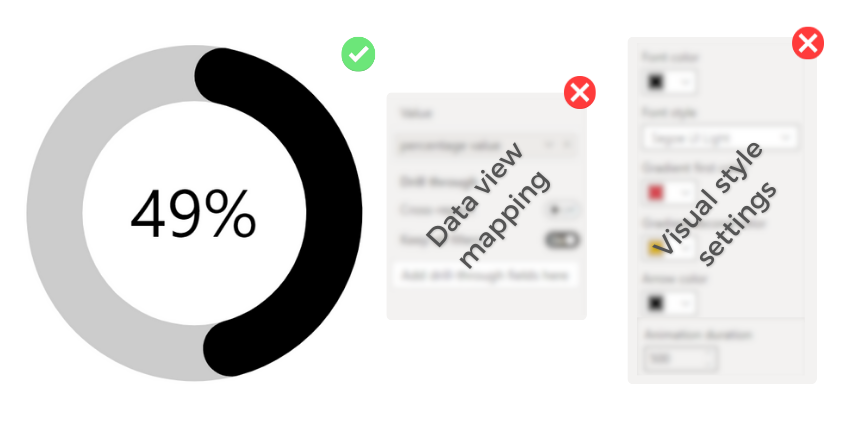
Data view mapping
Data view mapping makes the link between the underlying data and our visual.
Mapping data roles
In order to start the mapping, open the file named capabilities.json. The 'dataRoles' define what type of fields a user can place inside our visual. It differentiates 3 'kind': Measure, Grouping, and GroupingOrMeasure. In this case, only a single value is needed since the aim is to replace the percentage (pct) constant on the 'visual.ts' file. Therefore use the Measure type.
"dataRoles": [
    {
        "displayName": "Value in %",
        "name": "value",
        "kind": "Measure"
    }
],
The 'dataViewMappings' is responsible for how the role gets mapped to actual data from the Power BI report. In this mapping, the 'single' object means that a single value is expected. The 'role' property within this object specifies which role this mapping relates to, and this was set before in the name attribute ("name": "value"). The conditions can restrict how many fields can be dragged into the visual. Since it's a single KPI, it's set to a maximum of one item.
"dataViewMappings": [
    {
        "single": {
            "role": "value"
        },
        "conditions": [
            { "value": { "max": 1 }}
        ]
    }
],
After saving this in the debugging view, you are able to put a field inside the visual. To make sure it's appropriately mapped, go to the debugging view, drag a measure inside the visual, and click on the "Show Dataview" option under the visual. You should see the following, depending on the data, the value may be different.
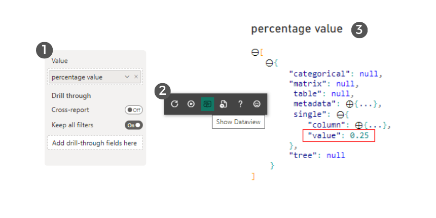
With this set, inside a visual update method, you can reach the value and log out in the console as well.
singleDataView = options.dataViews[0].single.value
console.log('pct', singleDataView) // outputs: 0.25
It would be obvious to use this inside the visual.ts file since it operates only with a single value. However, for more complex projects that would involve data transformations as well, putting everything into one file could compromise the readability and make future maintenance more challenging. To avoid that, make another TypeScript file and import it into the main 'visual.ts' file. This approach allows for performing data-related transformations separately.
Data transformation
Create the ‘data.ts’ file inside the ‘src’ folder with the following code:
"use strict";

import powerbi from "powerbi-visuals-api";
import VisualUpdateOptions = powerbi.extensibility.visual.VisualUpdateOptions;

export interface VData {
    value: number
}

export function TransformData(options: VisualUpdateOptions): VData | null {
    try {
        const dataView = options.dataViews[0];
        const singleDataView = dataView.single;
        return {
            value: singleDataView.value as number
        };

    } catch (error) {
        return null;
    }
}
In this file, first import the Power BI API packages that allow you to handle the changes to the visual. Then define an interface called 'VData', a structure used to represent the data and the type of value expected from the metadata. Next, define a function 'TransformData' that accepts 'VisualUpdateOptions' as input and returns either a 'VData' object or a null. This function aims to access the 'dataview', make data transformation if necessary (not in this case), and catch any error during the process (such as if 'singleDataView' doesn't have a value property).
In the end, import the 'data.ts' to the 'visual.ts', delete the static 'pct' value and return its new value.
import { TransformData } from "./data"; // Import the transformed data
...
public update(options: VisualUpdateOptions) {
  ...
  // Define variables
  const result = TransformData(options)
  const pct = result.value
  ...
}
Now the visual should show the actual value based on the field.
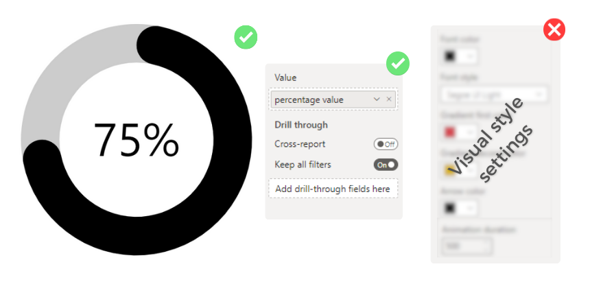
Visual style settings
To begin modifying the style of your custom visual, you first need to define the available settings within the capabilities.json file, which is responsible for specifying what objects and properties the Power BI visual can use. After determining the capabilities, the next step is to create these setting objects within the settings.ts file. This file holds all the customizable formatting cards and their default settings that your visual can use. Lastly, these created formatting card values must be imported into the 'visual.ts' file and associated with the corresponding attribute.
Set the capabilities
Open the ‘capabilities.json’ file again and replace the existing ‘objects’ with the following:
"objects": {
    "colorSettings": {
        "properties": {
            "fontColor": {"type": {"fill": {"solid": {"color": true}}}},
            "fontFamily": {"type": {"formatting": {"fontFamily": true}}},
            "gradiantColorFirst": {"type": {"fill": {"solid": {"color": true}}}},
            "gradiantColorSecond": {"type": {"fill": {"solid": {"color": true}}}},
            "arrowColor": {"type": {"fill": {"solid": {"color": true}}}}
        }
    },
    "animationSettings": {
        "properties": {
            "duration": {"type": {"numeric": true}}
        }
    }
},
Create the setting cards
To populate the formatting pane, use the 'setting.ts' file. Each created class here is a different tab on the setting pane, and at the end, the visual settings model class combines and exports them.
Open the 'settings.ts' file and create the 'colorSettings' class first:
class ColorSettings extends FormattingSettingsCard {
    fontColor = new formattingSettings.ColorPicker({
        name: "fontColor",
        displayName: "Font color",
        value: { value: "black" }
    });

    fontFamily = new formattingSettings.FontPicker({
        name: "fontFamily",
        displayName: "Font style",
        value: 'Segoe UI Light'
    });

    gradiantColorFirst = new formattingSettings.ColorPicker({
        name: "gradiantColorFirst",
        displayName: "Gradient first color",
        value: { value: "#025d93" }
    });

    gradiantColorSecond = new formattingSettings.ColorPicker({
        name: "gradiantColorSecond",
        displayName: "Gradient second color",
        value: { value: "#86f4ee" }
    });

    arrowColor = new formattingSettings.ColorPicker({
        name: "arrowColor",
        displayName: "Arrow color",
        value: { value: "black" }
    });

    name: string = "colorSettings";
    displayName: string = "Data colors";
    slices: Array<FormattingSettingsSlice> = [this.fontColor, this.fontFamily, this.gradiantColorFirst, this.gradiantColorSecond, this.arrowColor];

}
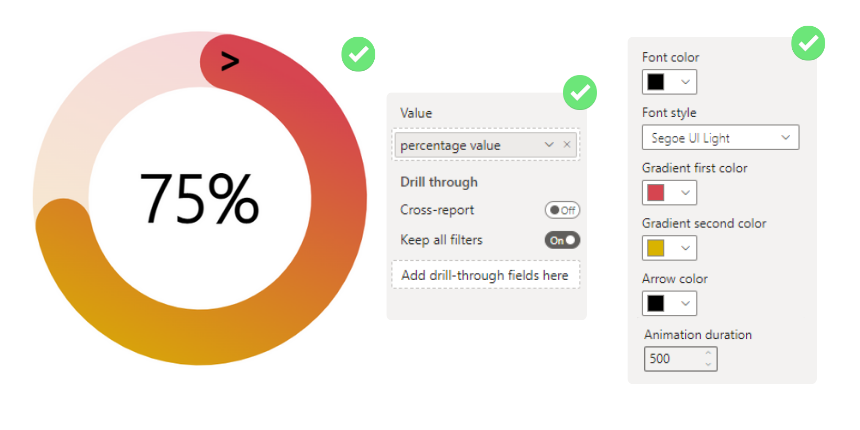
The font color ('fontColor') and the font style ('fontFamily') are used for the percentage label in the middle of the visual. The gradient colors ('gradiantColorFirst', ‘gradiantColorSecond') are for the gradient starting and ending color, which is used by the background and the progress arc as well, and the arrow color ('arrowColor') is for the top arrow style.
Then create the 'animationSettings' class:
class AnimationSettings extends FormattingSettingsCard {
    duration = new formattingSettings.NumUpDown({
        name: "duration",
        displayName: "Animation duration",
        value: 1000
    });

    name: string = "animationSettings";
    displayName: string = "Animation";
    slices: Array<FormattingSettingsSlice> = [this.duration];
}
The 'duration' is responsible for the animation speed on the progress arc in milliseconds. The higher the value is, the longer it takes to show the progression.
After that, update the visual setting model according to the created classes before:
export class VisualFormattingSettingsModel extends FormattingSettingsModel {
    colorSettingsCard = new ColorSettings();
    animationSettingsCard = new AnimationSettings();
    cards = [this.colorSettingsCard, this.animationSettingsCard];
}
You're now ready to import the visual formatting into the 'visual.ts' file. However, if you want to modify some styling attributes in the 'visual.less' file, you must create an additional TypeScript file called 'setstyle.ts'. Assign the attributes there, so you can use them as a CSS variable with a 'setProperty' function.
Create the ‘setstyle.ts’ file inside the ‘src’ folder with the following code:
"use strict";

import { VisualFormattingSettingsModel } from "./settings";

export function setStyle(s: VisualFormattingSettingsModel): void {
    const style = document.documentElement.style
    style.setProperty('--fontColor', s.colorSettingsCard.fontColor.value.value)
    style.setProperty('--fontFamily', s.colorSettingsCard.fontFamily.value)
    style.setProperty('--arrowColor', s.colorSettingsCard.arrowColor.value.value)
    style.setProperty('--gradiantColorFirst', s.colorSettingsCard.gradiantColorFirst.value.value)
    style.setProperty('--gradiantColorSecond', s.colorSettingsCard.gradiantColorSecond.value.value)
}Mapping style settings
Open the ‘visual.ts’ file and add the following new lines of code:
import { setStyle } from "./setstyle"; // Import the style
...
public update(options: VisualUpdateOptions) {
  this.formattingSettings = this.formattingSettingsService.populateFormattingSettingsModel(VisualFormattingSettingsModel, options.dataViews);
  setStyle(this.formattingSettings);
  ...
  // Define variables
  ...
  const animationSettings = this.formattingSettings.animationSettingsCard;
  const duration = animationSettings.duration.value;
  ...
}
Open the 'visual. less' file and add the following new lines of code:
 .pctLabel {
  text-anchor: middle;
  font-family: var(--fontFamily);
  font-weight: bold;
  fill: var(--fontColor);
}
.arrow {
   text-anchor: middle;
   font-family: Calibri;
   font-weight: bold;
   fill: var(--arrowColor);
 }
 #gradientFirst {
  stop-color: var(--gradiantColorFirst);
 }
 #gradientSecond {
  stop-color: var(--gradiantColorSecond);
 }
With this set, the visual should have the final look, with all the settings available.
Interactive features
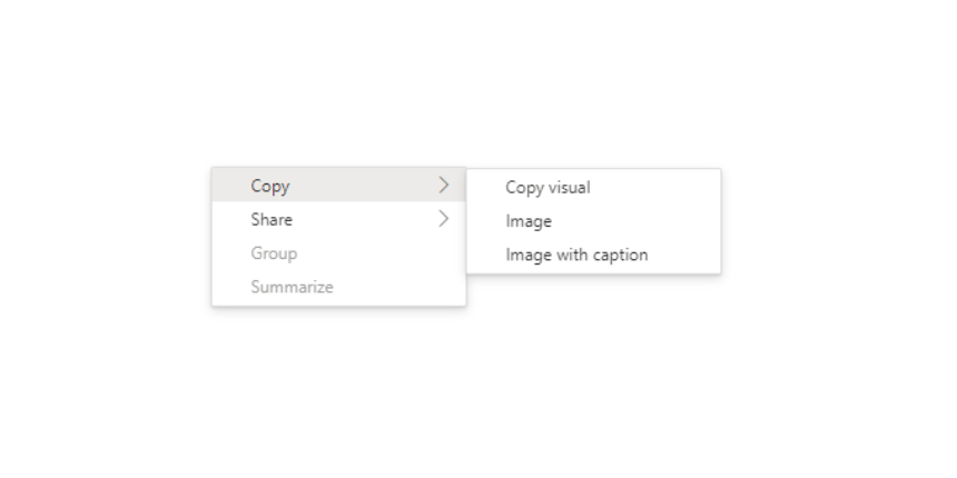
Implementing interactive features to the KPI is limited because it has only a single value assigned to the visual. However, every Power BI visual can display a context menu, allowing various operations on the visual, such as analyzing, summarizing, or copying it.
Create context menu
Import the selection manager to ‘visual.ts’
import ISelectionManager = powerbi.extensibility.ISelectionManager;Inside the visual class, add two new private properties:
export class Visual implements IVisual {
  ...
  private selectionManager: ISelectionManager;
  ...
  private handleContextMenu() {
    select(this.target).on("contextmenu", (event: MouseEvent) => {
        // Pass the appropriate dataPoint object instead of the empty object if needed
        this.selectionManager.showContextMenu({}, {
            x: event.clientX,
            y: event.clientY,
        });
        event.preventDefault();
    });
}Inside the constructor, declare the created selection manager and context menu:
constructor(options: VisualConstructorOptions) {
  ...
  this.selectionManager = options.host.createSelectionManager();
  this.handleContextMenu();
}
The visual can now use the basic context menu, which is let the visual export as an image or share it via Teams.
Visual deployment
Packaging visual
To package the visual, use the following line in the Power Shell while you are in the project folder:
pbiviz package gradientcirclechart-power-bi-custom-visualThis action creates a folder called 'dist', and inside it, a '.pbiviz' file that you can directly import a report. Note that some fields are mandatory to fill for a project, like an author name, email, etc. This information is located in the 'pbiviz.json' file.
Import to Power BI Desktop
Open the Power BI Desktop and import the visual from a file.
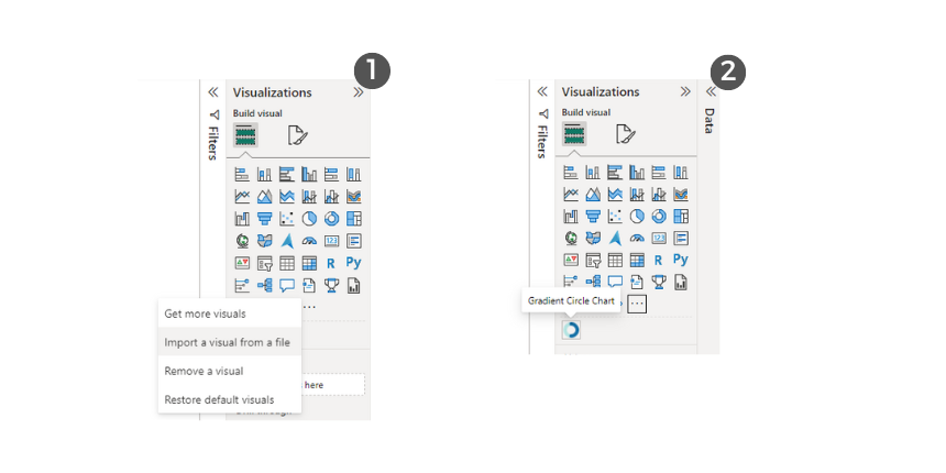
For more information about publishing requirements and guidelines, visit the Microsoft documentation.
